BluePrint Design System
I created a design pattern library for the strategic rebuild of the company’s product suite
Context
BluePrint is a platform of web-based financial tools developed by STP. The platform is used both internally by service teams and externally by business clients for carrying out financial services.
Due to the fast-paced, agile approach taken in the company’s early years - the tools within the product suite had very different code-bases and frustrating user experiences. In early 2022, we took on a complete redesign of the software, including a rebuild of every product service in a new tech stack and completely new UI providing streamlined user experiences.
Project
I partnered with product leaders, front and back end engineers, and domain experts to create pattern frameworks that backed the redesign of BluePrint. The result was a library of standardized components mirrored by a react component library. The effort is ongoing to maintain consistency in new builds, improve design fidelity in delivered items, communicate standards effectively in context.
Component library
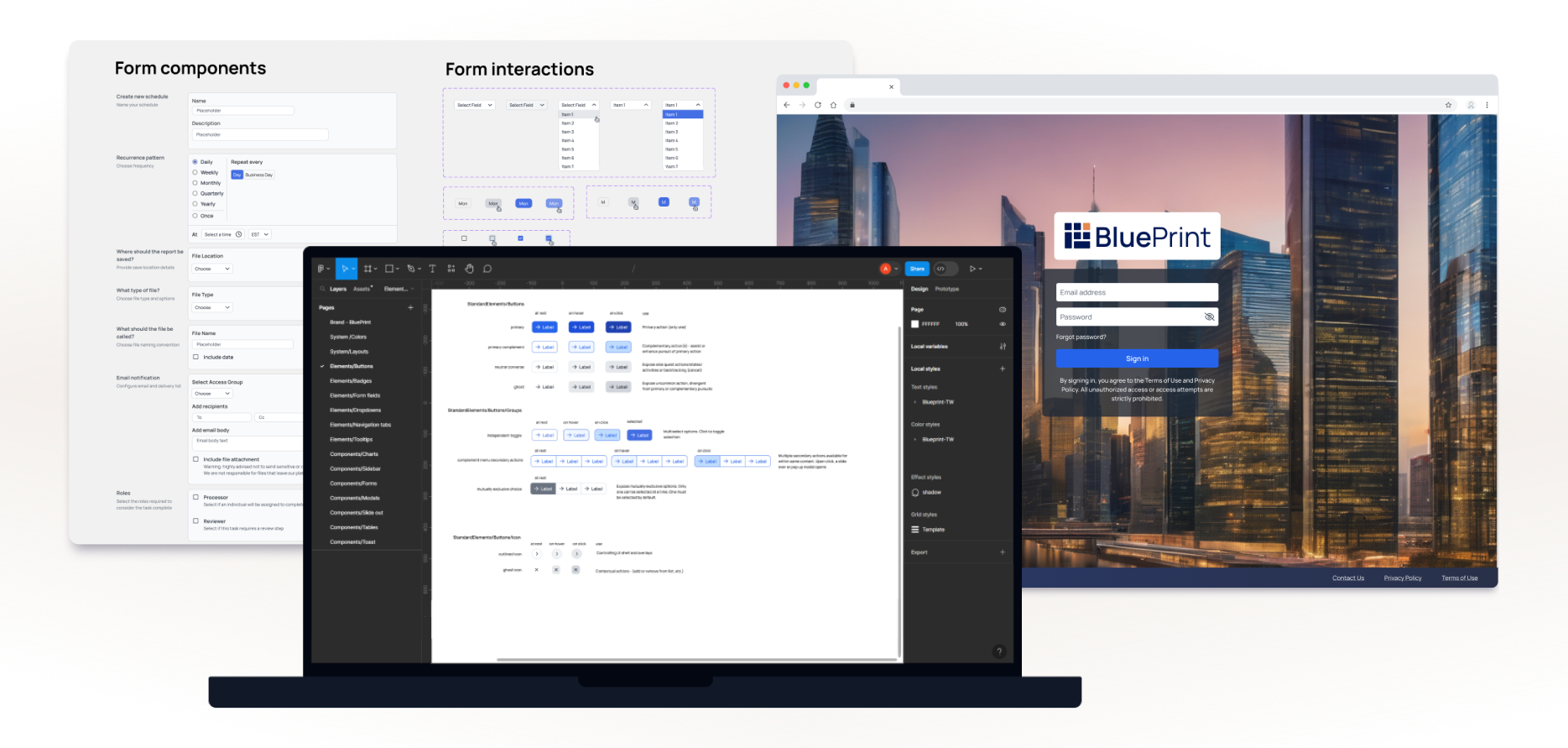
Our component library was built with utility-first classes from Tailwind CSS. I defined our base set of components using prebuilt elements from the Tailwind component library. My approach allowed us to stick to an early small set of standards and refine as we moved forward quickly.
White-labeling
It is important for our business clients to have brand jurisdiction over the platform experience, so white-labeling was essential to the design system. I incorporated a “brand” variable into component style definitions to allow for branding flexibility. See below how the look and feel of the sign-in changes drastically from swapping a few attributes.

Branded sign in
This is an example sign in page for a demo financial client who has licensed our product. My approach to white-labeling enabled a simple “swap” of branded components across the platform creating a seamless, professional user experience for any business licensing the product.

Layouts
Throughout different product services under the BluePrint umbrella, primary user goals differ across business workstreams and vary in business criteria for success. We aimed for consistent UI layouts and user flow frameworks throughout the platform to create a coherent look and feel.
To address this, I crafted a versatile set of standard page layouts, overlays and panels, and user flows (series of user actions connecting layouts to give them purpose), accounting for rigid data-security frameworks and nuanced dependencies among use and system status. We leveraged these standards across new features readily and saw a steep increase development efficiency as these patterns were reusued across all core experiences of our MVP.
Configuration - Utilizing layers across recurring user flows
This is an example of how I designed and incorporated a user flow pattern addressing many scenarios and eliminating potential sources of friction. Because of a shared set of fundamental user needs, I designed a single flow that aligned user experiences across the platform, creating a consistent environment and transferrable expectations for ease of use. This flow made it easy for users to learn how to leverage new functionality quickly and use it easily as repeated patterns cued users in on what to expect.
The wireframe below shows a simple edit and save flow. This workflow is leverage to support operational efficiency for frequent business tasks carried out by a core user base. The situation is that users needed to readily access controls to adjust the system properties in order to handle changing needs according to business circumstances - they needed to change properties “on the fly”. The challeng was to provide a smooth way to access, define, and save a set of properties without disrupting progress towards completing multi-step processes. (For example, users needed this type of affordance when updating the text to appear in a quarterly report and during a different process to define a custom group of accounts for the system to consider a single entity during reporting calculations.)
While both are quite different situation on the surface, they have a shared set of underlying user needs. The user flows needed to support quick access to configuration options, provide transparency of current configuration, and preserve context for continuing a multi-step complex task.
I considered different ways to present configuration options and compared how options would scale with growing sets of configurable fields. I also tested different options for preserving application context with the goal to help users complete their activity without having to break the natural flow of steps.

Navigation and content sidebars
Double side bar with open and closed states handles high level context and drives secondary content. Open states enable the user to select data within the product environment. Closed states maximize horizontal space available for the primary task. Side bars maintain their hierarchical relationships among elements across products, while data type within elements differs according to context.

Modular Forms
Above is an example UI using the system. A good deal of the product suite’s scenarios involved fillable forms and data entry. The forms pattern was designed to be highly versatile and modular to account for a wide array of product scenarios - from capturing static options to dynamic, dependent attributes.

Custom components
Many design sprints required components that could not be built using the existing design system due to the complexity of business requirements. The challenge was to work within system styles for consistency while allowing for unique rules that deviate from system standards.
Simplifying the UX of choosing complicated schedule logic
I made custom components which deviate from established patterns in carefully chosen ways to streamline users towards a business need. Scheduling is a common task with high business-driven complexity and it’s relied upon for critical tasks with low tolerance for error. So I designed this component, eliminating the guess work within schedule creation, providing schedules users could trust. Check out this case study for a closer look at my approach to scheduling with business day logic.
Conclusion
As BluePrint and its user-base expand, so does the design system. Ongoing product discovery and development allow us to challenge what has worked before and make informed improvements.
Thanks for stopping by!
Check out my other projects.
-
![]()
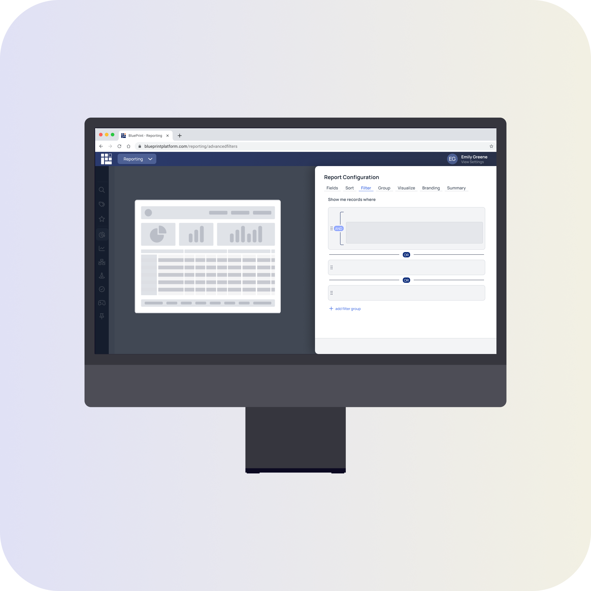
Advanced Filtering
-
![]()
Fund Investor Experience
-
![]()
Scheduling Component